.png)
Photobook Analysis
Photobook Analysis: Ballet by Alexey Brodovitch
Details:
Title: Ballet
Published: 1945
Publisher: J.J. Augustin. New York.
Dimensions: 28 x 22 cm
Pages - 144
Cover Design:
The cover of Alexey Brodovitch’s Ballet is elegant and minimal, using only bold typography to suggest the coming rhythm and movement, like dancers posed on stage waiting for the performance to begin.
Subject Matter:
Ballet by Alexey Brodovitch is about capturing the fleeting energy and atmosphere of ballet through blurred, dynamic photographs that convey movement more than form.
Photography:
Ballet expresses the temporary, emotional power of dance, focusing on the rhythm and mood of the performance instead of just static poses. Brodovitch's goal is pretty clear: he’s not just trying to document ballet as it looks on stage; he’s really interested in translating its fleeting energy into photographs. Brodovitchs' style is experimental; utilizing blur, grain, and high contrast to push photography towards abstraction. These techniques fit the intention perfectly, bringing out the feeling of movement and impermanence that characterises live performances. Overall, the book feels like the experience of being immersed in the performance experience.
Page Layout:
Ballet’s design is unique and eye-catching, especially for its time. Brodovitch moved away from neat layouts, choosing instead to use overlapping photos, bold cropping, and different sizes to create the narratives’ rhythm. Most pages are full spread, full-bleed images, which have a cinematic effect on the viewer's experience. Other spreads show similar images side by side to highlight dynamic movement of the dancers, while maintaining the flow of the book's layout. The combination of the photography techniques, capturing the performance's energy, and the layout of the varying sizes, contrasts, and placements, keeps the viewer engaged and excited. The layout takes viewers on a journey through moments of calm, intensity, and motion, making the book feel like a performance itself.
Text
The title uses a font similar to Adobe Smoosh 3 Black. It is energetic, elegant, full of excitement and anticipation, like dancers waiting to take the stage.
The subtitle is a delicate script font that is elegant and is similar the Adobe Altesse.
There is an introduction in the book by Edwin Denby, which is dispersed throughout the first chapter. Title pages for each segment that have decorative and different fonts that reflect the feeling of the performance or rehearsal that is captured in that section.
"The End" page uses the same font as the book title page, but the spacing of the letters is more prominent - allowing the title to hold more authority, as it's more solid in its structure.
At the end of the book, an index is provided that lists each page number and the source (show) of every photo. In some cases, the choreographers, set designers, and costume makers who contributed to the work are also acknowledged.
Editing & Sequencing
The editing and sequencing of Ballet is used to emphasise movement, rhythm, and atmosphere rather than clarity. The sequencing feels like a performance, images flowing from one to the next. Each segment feel like an act of a much larger show. The intertwining essay in the first segment, with more still images of behind-the-scenes, builds the Ballet worlds' base from which the narrative can take launch. Each segment then builds in movement, dancers, energy and experimentation until we reach "The End" page.
Overall Design
The images are printed on uncoated paper, softening the contrast and giving them a grainy, atmospheric quality.
No end sheets are included; the book has a stripped-back design that keeps the focus on the photos.
No colophon is present in the modern sense; the page opposite the title page features the publisher's insignia, and a small copyright statement is found on the back of the title page.
Influence on my work
Looking at Ballet by Alexey Brodovitch gave me a lot of confidence in how I approached my own book. What stood out to me was how he wasn’t interested in perfect clarity, but in capturing the feeling of performance. The blur, the grain, the fragments of motion all made me realise that I don’t need to chase precision, in order to tell the truth of a performance.
I also took a lot from the way the book is sequenced. The images come at you with no quiet space, one after another, which feels relentless and immersive. That’s something I wanted to echo, because The Butterfly Club itself didn’t really have room for your eyes to rest either.
The minimal text in Ballet reassured me that a book can rely almost entirely on images to tell its story, and that rhythm, repetition, and design choices can carry the narrative.
Most of all, Ballet showed me that editing doesn’t need to be linear or neat. It can be impressionistic and still powerful, and sometimes it’s the imperfect or fleeting image that carries the most emotional truth.

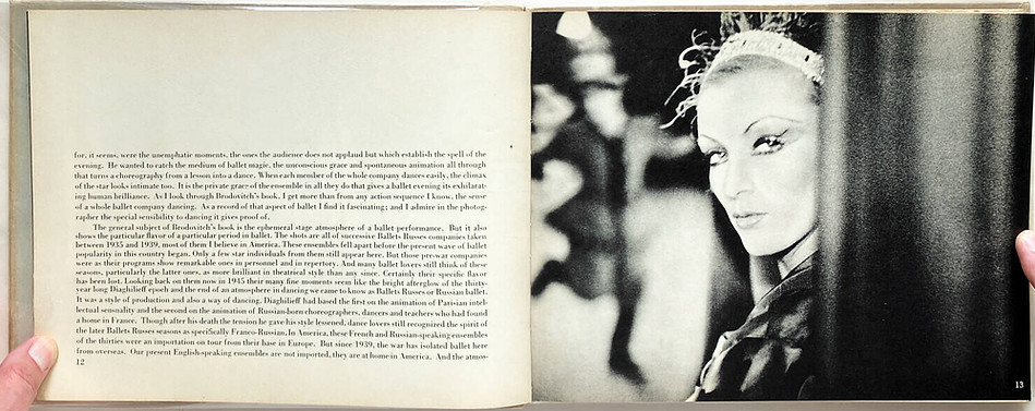
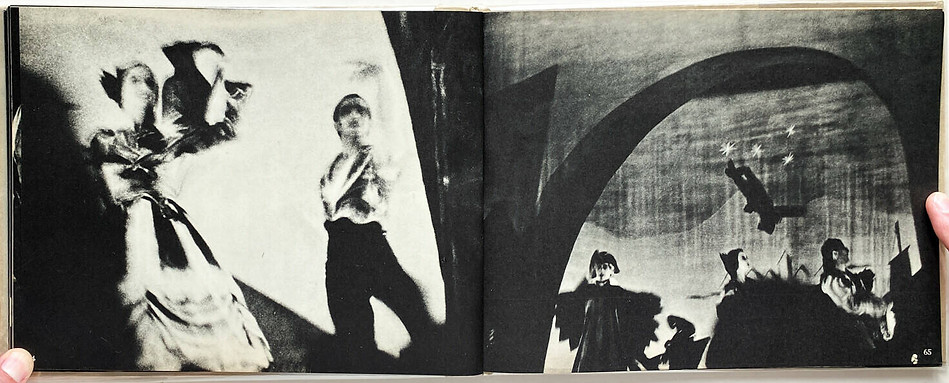
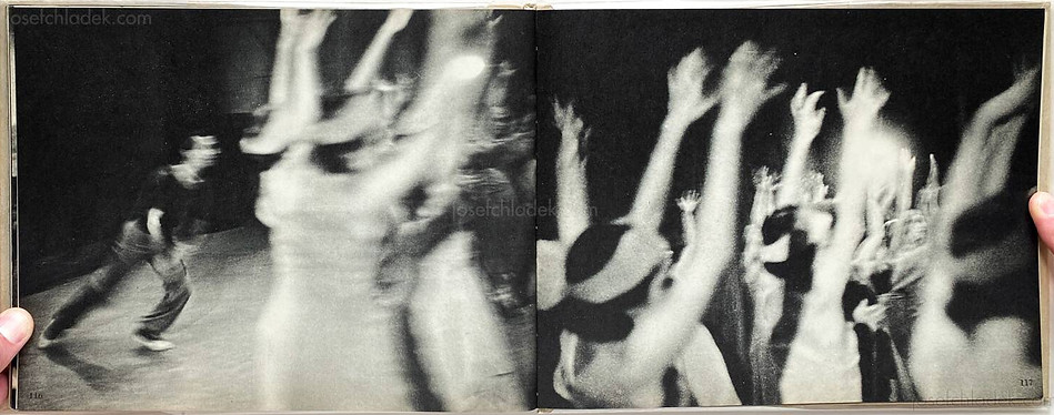
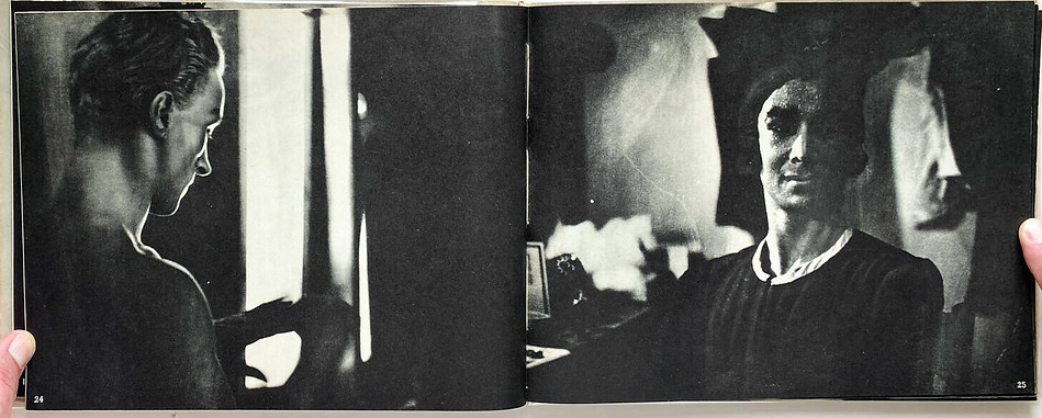


Selected spreads from Ballet [Photobook] by A. Brodovitch (1945), available via Josef Chladek Photobook Collection, https://josefchladek.com/book/alexey_brodovitch_-_ballet
The Klieg Light. (2013, July 6). Ballet by Alexey Brodovitch [Video]. Vimeo. https://vimeo.com/69773084